GIMP: Single column toolbar
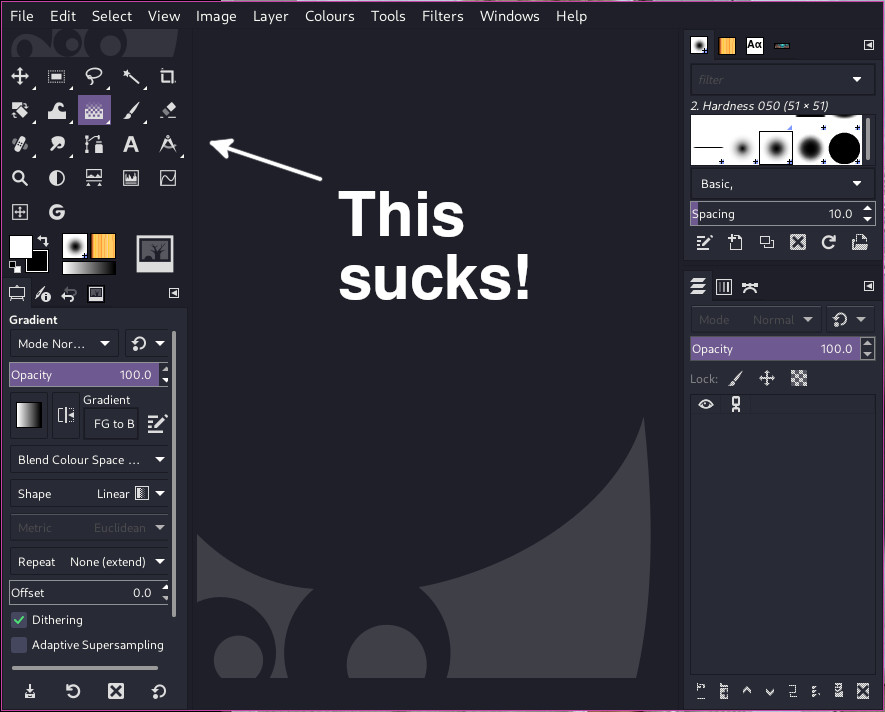
I was working in GIMP today on some large images, and the one thing that was bugging me, was how long it was taking me to find the tools I needed on the toolbar. The multi-column toolbar (which is set as default in GIMP) was slowing me down, and the width of it was taking up space that I could use for editing or painting.
Having used a lot of image editing software over the years, I've grown to like just having one single column for tools. For me, this makes it easy to find the tools I need when working on an image, build muscle memory, and makes editing faster.
However, with multiple columns and rows, and on top of that, tool groups - things where getting confusing fast.
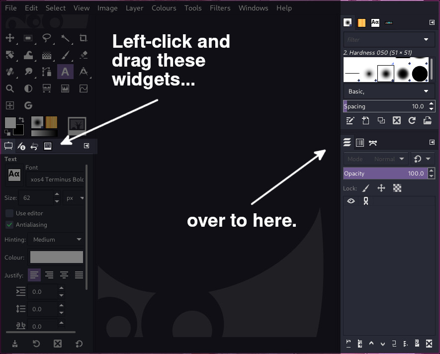
I can't work with GIMP's four column toolbar layout by default, it drives me insane! So, I took a look in the preferences to see if I could change it from there. Oddly, there are no options in the preferences to simply enable this. However, with a bit of click'n'drag in the main GIMP window, it can be done.
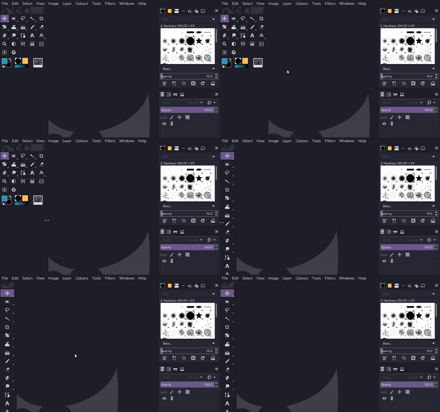
First, move the widgets on the left over to the right panels.
Now you're able to left-click and drag the panel and make it narrower until you get a single column layout for the widgets.
Simple, quick and easy! I can now get back to editing images, rather than playing "Whac-A-Mole" looking for tools. 👍


